In this discussion we will focus on the items relating to dashboard types or views shown based on the search performed. For more information, please visit the page discussing the specific Dashboard Type.
NOTE: This is a generic introduction to help familiarize yourself with the core components available.
Items that are specific to a particular Dashboard will be discussed in greater detail within each specific Analytic offering.
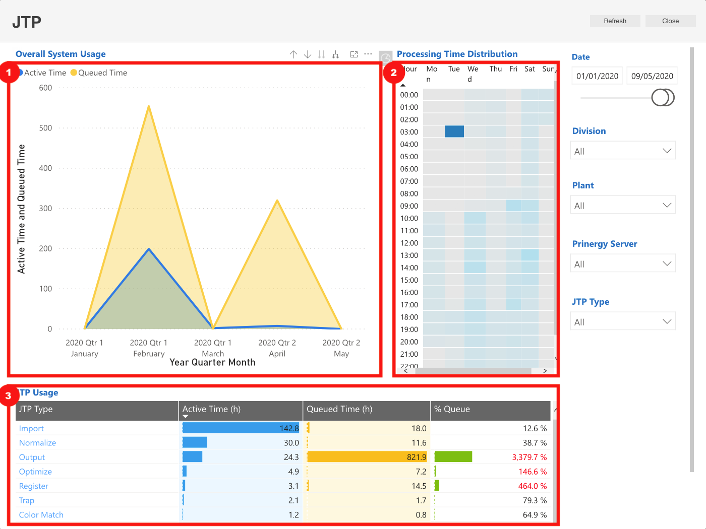
- Time Series Charts - this highlights the peaks and valleys over a window of time based on your query.
- Could also be shown as horizontal or vertical bar charts or as a pie chart.
- Heat Maps - shows the HOT and COLD cells (time) within a time based snapshot of your query.
- Darker shaded cells - highlight the higher, stronger or more active points.
- Lighter shaded cells - highlight the little to no activity.
- Tables - typically this is the list of all the results associated to the query within the Time Series and Heat map views.
For more information:
- Dashboard Introduction...
- Analytics User Interface - overall view of the dashboards
- Visualization Toolbar - tools available to find more information
- Filters - details in which to hone (focus) the details within the dashboards