In this discussion we will explore the Job Ticket Processor (JTP) dashboard.
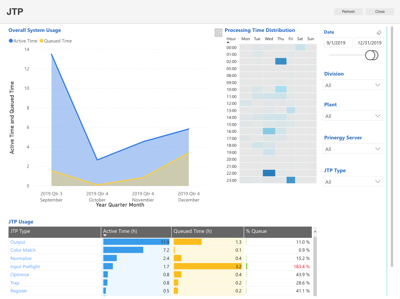
In the JTP Activity dashboard, you can view the following reports and charts:
Number | Name of report/chart | Description |
|---|---|---|
| 1 | Overall System Usage | Displays the active processing time and the queued (wait) time for all job ticket process (JTPs) types (ex: Output, Retrieve, or Color Match) based on a selected filter. Note: Adjust the date/time range by dragging the edges of the slider to the required period. |
| 2 | Processing Time Distribution | Displays the distribution of the active time for all the JTP types (per hour) relative to other times in the same day of the week. The darker areas indicate high levels of activity. |
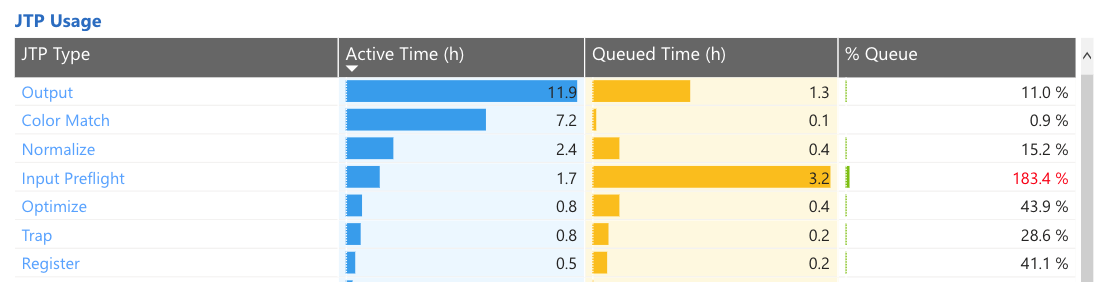
| 3 | JTP Usage | This report is displayed as a table and provides a comparison between the active and queued times of each JTP type and the ratio between them. (The table is also color coded). Note: If the queued time of a specific JTP type is longer than its active time, the % Queue Bar value will be displayed in red. In this report you can drill down and view the active time and queued time of each JTP type group in each server.
|
This dashboard provides information:
- about the ratio between the active time and the queued time of a specific JTP type, over a specific time period and per server.
- to help identify processing performance issues by JTPs, by viewing historic changes in processing performance on specific dates over time.